Marketing is an important tool for working with the target audience and Internet promotion, establishing direct communication between business and customers. The goal of such efforts is to strengthen loyalty and increase sales.
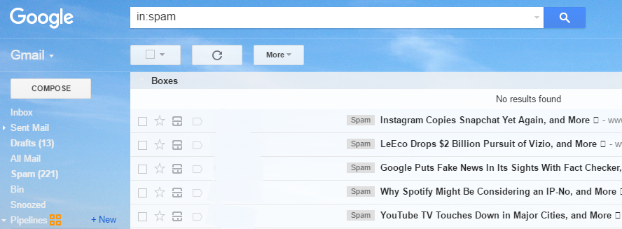
Nowadays, many companies use this tool to advertise their products or services. Commercial offers sent by e-mail are targeted to a specific category of people who are interested in such information. In other words, the recipients are not only aware of the possibility of receiving such letters from the advertiser but also have agreed on this. This is the main difference between email marketing and abstract spam e-mails.
We will help you to improve your newsletters with recommendations for the graphic and textual design of the e-mail. Increase the level of viewing letters and the coefficient of advertising effectiveness, which, accordingly, should enlarge the number of your sales.
1. The subject line of the letter should be laconic and intriguing.
Just think of it: the decision of the half of your subscribers about whether or not to open the letter depends only on what is indicated in the subject line. Understanding how your recipients view your email marketing messages is absolutely essential. If you want to succeed and craft a great subject line, you need to view your messages through the eyes of your customers. Also note that your letter may be banned if you use words as “free”, “share”, “money”, or overuse exclamation marks, make spelling mistakes in words, use upper-case characters etc. More about subject lines you can find in the Guide to E-mail Subject Lines.
2. Do not forget about the line “from”.
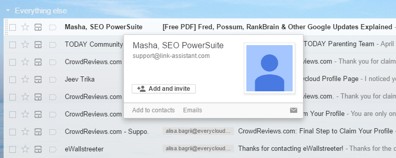
In the line “from” you tell your recipients who sent a message to them. In order to be recognized right away, specify the name of your company or object in this line, instead of the employee’s name or even more, specify them both, your name and the company brand. In such way, you gain more loyalty, as the recipient knows whom to apply, in case he is interested in the new product. Try to put yourself in recipient’s place and notice what you do with e-mails from unknown senders or just from john.k@gmail.com.
3. Use the information in the preview.
The information displayed in the preview is before the header of the message (in the example it is Outlook mailbox). Use it to describe the subject of the letter and persuade the reader to open your message – after all, most mail programs show the first lines of the letter just in the preview window. So you know exactly what will be displayed before opening the letter. Summarize the reason of your message, using not more than 100 characters. Advertise your letter, do not waste these lines on something unattractive like “can not view this message?” Or “add us to your list”.
In Gmail, the recipient sees the half of the first sentence, which he usually reads before opening. While compiling your message, keep in mind to make this part as attractive as possible.
4. Your letter should have a clear call to action.
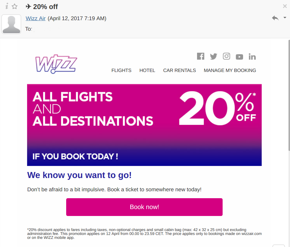
This is the most important part of your message. What exactly do you want your addressee to do? Book the hotel room now? Put a mark “I like” on the page of your hotel in Facebook? Make sure that your text, images, and design are consistent with your call to action.
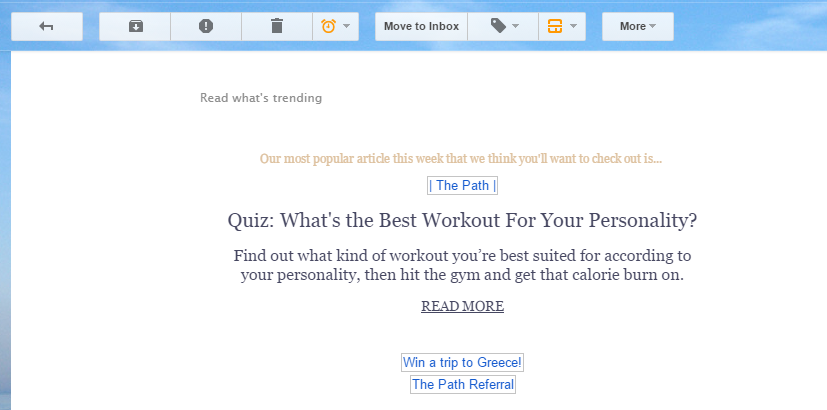
Buttons are graphical calls to action (for example, “book a room” or “read more”), which are created on the basis of HTML, and are not inserted in the form of a picture. As they are embedded in the message code, they are displayed even if the automatic image download feature is disabled.
The e-mail recipient must, at first sight, understand what information in your letter is the most important. Use a large and conspicuous headline, and the subheadings smaller and less noticeable. For legal information and links to change settings, select a small but readable font. If the message text is too voluminous, use subheadings to break it into legible paragraphs, the size of which should not exceed three lines.
5. Do not overuse images.
Most email clients block images in emails until the recipient allows them to be displayed in emails received from a particular sender. If you use only images, then you risk losing subscribers who do not have the patience for a letter full of gray empty squares, or, worse, your letter will be in the spam folder. Many spam filters track messages that consist only of images. Despite the fact that we strongly recommend the use of bright images in letters, do not forget to add advertising text, links to images and captions to them.
Additional tip: Before you click the “Send” button, do a test mailing. Make a list of employees or trusted friends who could check each message before sending it to subscribers. Check that your list includes all popular email clients, including Gmail, Outlook, and Yahoo. Also, do not forget to check how the message looks on mobile devices. Almost half of all emails are opened by users on mobile devices. Check that your message is readable on smartphones and tablets.
